Web Design
Finance

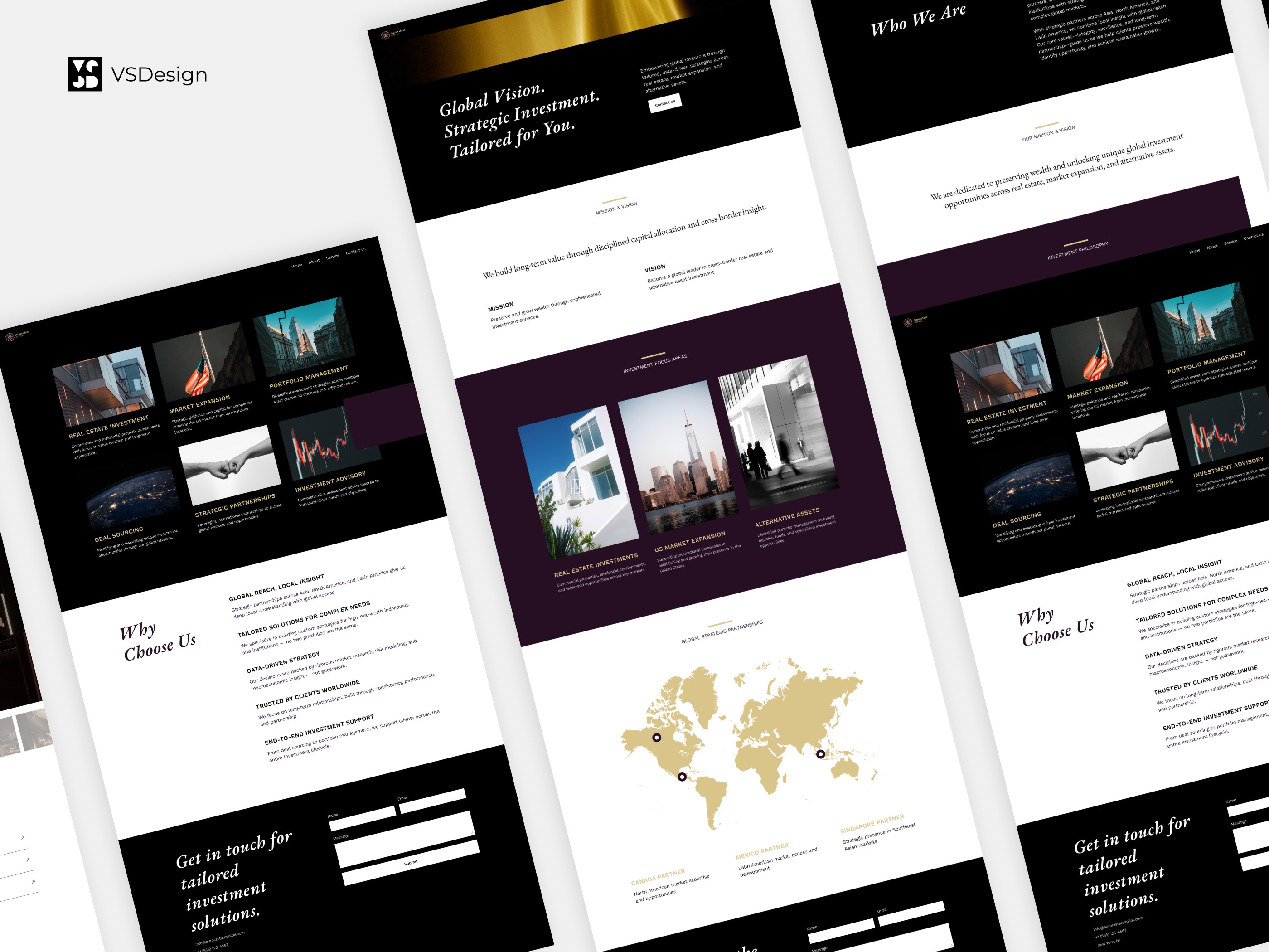
Aurora Star Capital - Investment Brand Website

How clearer IA and modern UI boosted trust and conversion across markets?

Client: Aurora Star Capital – A global investment management firm specializing in cross-border real estate and alternative asset strategies

Project Timeline: April 2025 – June 2025

VSDesign Role: Information Architecture Optimization · Brand Visual System Development · Desktop & Mobile UX/UI Design · Vectorized Brand Asset Creation

Aurora Star Capital serves high-net-worth individuals and institutions with tailored, data-driven investment strategies across real estate, U.S. market expansion, and alternative assets. As the firm expanded its international footprint and diversified its client base, it required a next-generation website to embody its brand values of professionalism, trust, and global sophistication, driving stronger user acquisition and reinforcing its reputation worldwide.

How Did We Help Aurora Star Capital Rebuild Its Global Website to Earn Trust, Drive Leads, and Scale Across Markets?

Premium UX Template for Framer

From weak visuals to world-class presence.

Aurora Star’s old website didn’t reflect the caliber of their clients or portfolio. We built a sleek, multilingual site that matched the professionalism expected from a global investment firm.

Premium UX Template for Framer

From weak visuals to world-class presence.

Aurora Star’s old website didn’t reflect the caliber of their clients or portfolio. We built a sleek, multilingual site that matched the professionalism expected from a global investment firm.

Premium UX Template for Framer

From weak visuals to world-class presence.

Aurora Star’s old website didn’t reflect the caliber of their clients or portfolio. We built a sleek, multilingual site that matched the professionalism expected from a global investment firm.

Premium UX Template for Framer

We rebuilt everything- from brand to structure.

We designed a cohesive visual identity, restructured the site’s navigation and user flows, and optimized key conversion journeys (Homepage → Services → Contact) to boost engagement.

Premium UX Template for Framer

We rebuilt everything- from brand to structure.

We designed a cohesive visual identity, restructured the site’s navigation and user flows, and optimized key conversion journeys (Homepage → Services → Contact) to boost engagement.

Premium UX Template for Framer

We rebuilt everything- from brand to structure.

We designed a cohesive visual identity, restructured the site’s navigation and user flows, and optimized key conversion journeys (Homepage → Services → Contact) to boost engagement.

Premium UX Template for Framer

High-end doesn't mean high maintenance.

Our modular system, responsive design, and scalable assets now enable Aurora to manage and grow their digital presence efficiently across web and social platforms.

Premium UX Template for Framer

High-end doesn't mean high maintenance.

Our modular system, responsive design, and scalable assets now enable Aurora to manage and grow their digital presence efficiently across web and social platforms.

Premium UX Template for Framer

High-end doesn't mean high maintenance.

Our modular system, responsive design, and scalable assets now enable Aurora to manage and grow their digital presence efficiently across web and social platforms.

Premium UX Template for Framer

This is what investors expect.

In a space where trust is everything, we made sure every visual, every word, and every click reinforced Aurora’s credibility and global ambition.

Premium UX Template for Framer

This is what investors expect.

In a space where trust is everything, we made sure every visual, every word, and every click reinforced Aurora’s credibility and global ambition.

Premium UX Template for Framer

This is what investors expect.

In a space where trust is everything, we made sure every visual, every word, and every click reinforced Aurora’s credibility and global ambition.

Project background

Aurora Star Capital’s previous website lacked the structure and polish needed to represent a premium global investment firm. It suffered from disjointed visuals, weak content organization, and poor user flow, which undermined its professional image and created friction for potential clients and international partners. The challenge was to design a digital platform from the ground up that not only modernized the user experience but also projected a cohesive, high-end brand identity aligned with Aurora’s global ambitions.

Key Challenges
1

Fragmented Visual System, Weak Branding

The site lacked a consistent design language and international visual aesthetic, diminishing trust and professionalism.

1

Fragmented Visual System, Weak Branding

The site lacked a consistent design language and international visual aesthetic, diminishing trust and professionalism.

1

Fragmented Visual System, Weak Branding

The site lacked a consistent design language and international visual aesthetic, diminishing trust and professionalism.

1

Fragmented Visual System, Weak Branding

The site lacked a consistent design language and international visual aesthetic, diminishing trust and professionalism.

2

Weak Information Architecture

Homepage content was overly generic; critical brand messaging was buried, while missing navigation and footer elements made it difficult for users to understand the company’s positioning and services.

2

Weak Information Architecture

Homepage content was overly generic; critical brand messaging was buried, while missing navigation and footer elements made it difficult for users to understand the company’s positioning and services.

2

Weak Information Architecture

Homepage content was overly generic; critical brand messaging was buried, while missing navigation and footer elements made it difficult for users to understand the company’s positioning and services.

2

Weak Information Architecture

Homepage content was overly generic; critical brand messaging was buried, while missing navigation and footer elements made it difficult for users to understand the company’s positioning and services.

3

Unclear Conversion Pathways

Ineffective CTAs and user flows hindered lead generation and engagement with potential partners.

3

Unclear Conversion Pathways

Ineffective CTAs and user flows hindered lead generation and engagement with potential partners.

3

Unclear Conversion Pathways

Ineffective CTAs and user flows hindered lead generation and engagement with potential partners.

3

Unclear Conversion Pathways

Ineffective CTAs and user flows hindered lead generation and engagement with potential partners.

Design solutions

1

Reimagined Information Architecture

Crafted a clear modular structure and intuitive user pathways, optimizing the “Homepage → Services → Contact” journey to enhance readability and conversion.

1

Reimagined Information Architecture

Crafted a clear modular structure and intuitive user pathways, optimizing the “Homepage → Services → Contact” journey to enhance readability and conversion.

1

Reimagined Information Architecture

Crafted a clear modular structure and intuitive user pathways, optimizing the “Homepage → Services → Contact” journey to enhance readability and conversion.

2

Modernized Visual System

Developed a sophisticated, international UI language with comprehensive style guides (typography, color palette, graphic elements, and whitespace strategy) for consistent branding across platforms.

2

Modernized Visual System

Developed a sophisticated, international UI language with comprehensive style guides (typography, color palette, graphic elements, and whitespace strategy) for consistent branding across platforms.

2

Modernized Visual System

Developed a sophisticated, international UI language with comprehensive style guides (typography, color palette, graphic elements, and whitespace strategy) for consistent branding across platforms.

3

Immersive Hero Section Redesign

Created an impactful hero area with dynamic visuals and motion design to strengthen brand messaging and capture attention at first glance.

3

Immersive Hero Section Redesign

Created an impactful hero area with dynamic visuals and motion design to strengthen brand messaging and capture attention at first glance.

3

Immersive Hero Section Redesign

Created an impactful hero area with dynamic visuals and motion design to strengthen brand messaging and capture attention at first glance.

4

Responsive and Accessible Design

Delivered a seamless experience across desktop and mobile, ensuring compliance with WCAG standards to support a diverse global audience.

4

Responsive and Accessible Design

Delivered a seamless experience across desktop and mobile, ensuring compliance with WCAG standards to support a diverse global audience.

4

Responsive and Accessible Design

Delivered a seamless experience across desktop and mobile, ensuring compliance with WCAG standards to support a diverse global audience.

Business Impact

Enhanced Brand Perception

Built a cohesive, premium visual system that strengthened trust among high-net-worth clients.

Optimized Global Reach

Responsive, multilingual design enabled seamless engagement with international audiences, supporting cross-market expansion.

Improved Conversion Efficiency

Streamlined CTAs and clearer content hierarchy boosted inquiries and potential partnership opportunities.

Unified Digital Brand Assets

Vectorized design elements facilitated consistent and efficient brand deployment across web and social channels.